From good to great: redesigning a sausage chart
No worries, a ‘sausage chart’ is not a new alternative to a pie chart, donut chart, or waffle chart. Today, we’re tackling a chart about sausages.
Researchers at the university of Oxford have evaluated 57 000 food products to estimate their environmental impact, as well as how nutritious they are. Among those food products were 503 different sausages. Grouping them by type (ruminant, pork, poultry, vegetarian or vegan) shows how vegetarian and vegan sausages are not only more environmentally friendly, but also more nutritious:
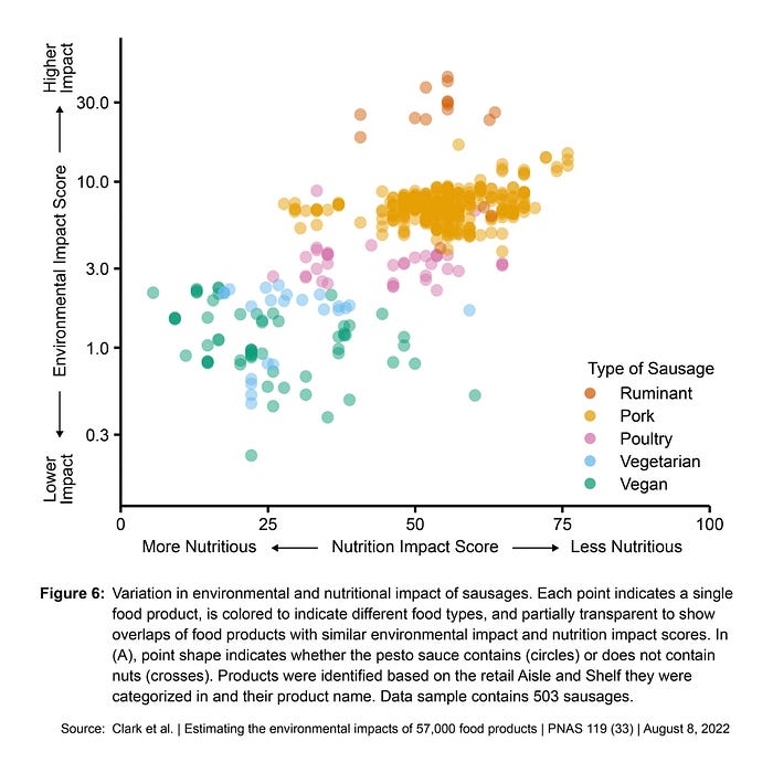
This is actually a good chart with data that’s easy to read and quite straightforward to interpret. But can we make it even better?
Spoiler: yes!
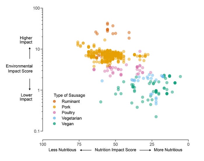
Optimizing the axes
Four things bother me about the vertical axis:
- The lines are a bit too heavy.
- It is not immediately clear that it’s a logarithmic axis, not a linear one.
- Because it’s a logarithmic axis it can’t start from zero, but by intersecting it with the horizontal axis, it does feel that way.
- The rotated text is hard to read.
We can solve these problems by making the lines thinner, adding additional ticks to show the logarithmic scaling, separating the horizontal axis, and putting the text horizontal:

When it comes to the horizontal axis, I find the direction a bit confusing. In a chart, we typically associate the left hand side with ‘less’ and the right hand side with ‘more’. But here, we have ‘more nutritious’ on the left, and ‘less nutritious’ on the right. Let’s switch that around and see how it looks:
Small multiples make everything better
What are we actually looking for in the visual? What’s the story? Why are we sharing it in the first place?
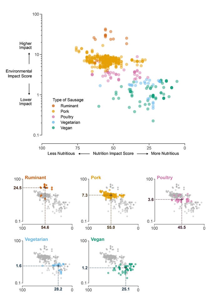
By presenting the data in this way, we want to make a comparison between the five groups of sausages: ruminant, pork, poultry, vegetarian and vegan. Putting them all together on a visual makes it possible to see the general picture, but identifying each individual group becomes quite hard. Estimating the average environmental impact and nutritious value of each group by itself is difficult to do.
When you have too much info on a single chart, small multiples are often your way out. In our case, we can combine the original chart with a set of small multiples, each highlighting one of the five groups:
Tweaking the visual hierarchy
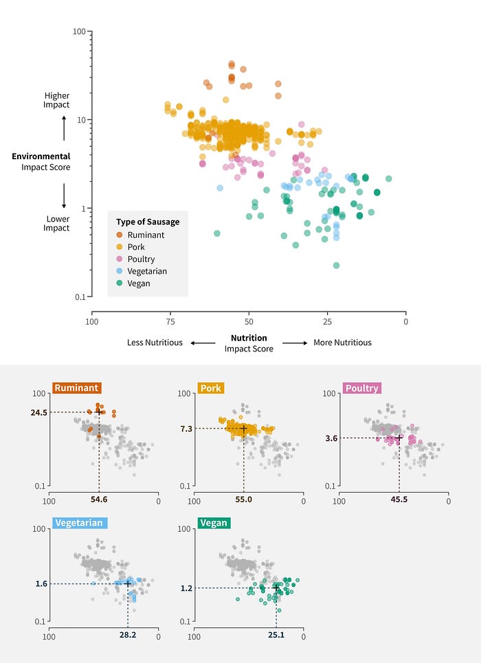
What’s still missing in the current version is some sense of visual hierarchy. All the text has more or less the same size, weight and color, and nothing really stands out. The legend is floating somewhere in the chart area. The font (Arial) is quite bland. Let’s see how we can tweak this by changing the font, playing with font weight, and adding some background to make the legend and subtitles stand out more:
Better text, better visual
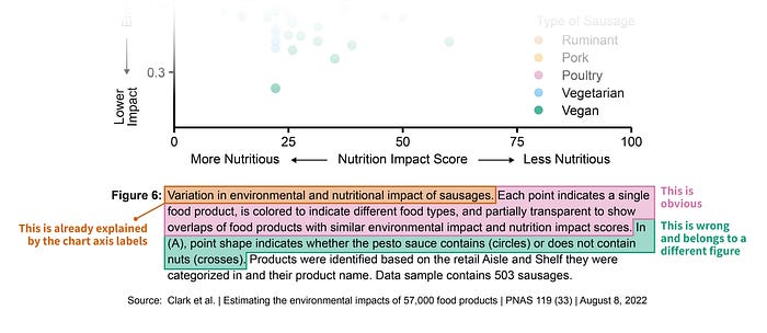
A final point of concern is the text. In the original visual, the caption is relatively weak.
First of all, a big part of the caption is unnecessary. It is clear from the chart, too obvious to explain, or just plain wrong (one sentence feels copy pasted from a totally different figure):
If we wanted to share these results in a presentation, a blog post, or on social media, we might rewrite the text and turn it into a clear title and helpful paragraphs as follows:

And there we have it — we turned our original chart, which was already good, into a great visual that shows the big picture, provides a detailed breakdown for comparison, clearly indicates the key message, and adds some visual hierarchy to bring more structure to the information.
