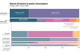
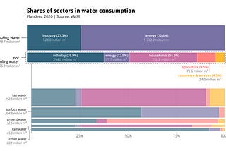
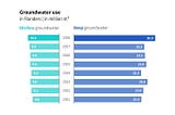
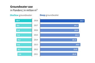
PinnedKoen Van den EeckhoutDe-complicating chartsIn June 2022, VMM (the Flanders Environment Agency) published some interesting new data on water consumption in the region. It describes…6 min read·Aug 11, 2022----
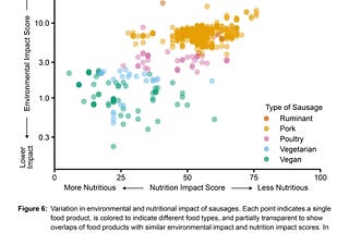
Koen Van den EeckhoutFrom good to great: redesigning a sausage chartNo worries, a ‘sausage chart’ is not a new alternative to a pie chart, donut chart, or waffle chart. Today, we’re tackling a chart about…4 min read·Apr 7, 2023----
Koen Van den EeckhoutThree tips to create powerful charts in ExcelMicrosoft Excel can be a powerful tool for making sense of complex data sets, and for visualizing them. By creating charts and graphs in…3 min read·Dec 12, 2022----
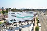
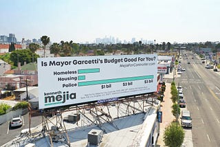
Koen Van den EeckhoutHow powerful charts can boost your careerAn American accountant managed — as the youngest ever! — to win a crucial election in Los Angeles — thanks to the power of data…2 min read·Nov 16, 2022----
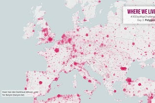
Koen Van den EeckhoutBehind the mapsThinking, tools and techniques behind my #30DayMapChallenge submission23 min read·Jan 6, 2021--2--2
Koen Van den EeckhoutUncommon chart types: SlopegraphsMaybe you have never heard the term ‘slopegraph’, but chances are high that you have seen one before. They appear in serious newspapers…5 min read·Jun 7, 2020----
Koen Van den EeckhoutFive steps towards improving your dashboardDo you know the feeling? You spent days, weeks, maybe months to build the perfect dashboard for your clients. But when you share it, the…6 min read·May 18, 2020----
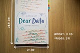
Koen Van den EeckhoutDear Data: Dataviz book review⭐⭐⭐⭐ Dear Data by Giorgia Lupi and Stefanie Posavec is a delightful cross-over between #datavisualization and hand-drawn art.5 min read·May 4, 2020----
Koen Van den EeckhoutData visualization tools: DatawrapperLet’s not beat around the bush in this blog post. If you are writing articles online and need to quickly insert beautiful, interactive…2 min read·Apr 26, 2020----